Composition
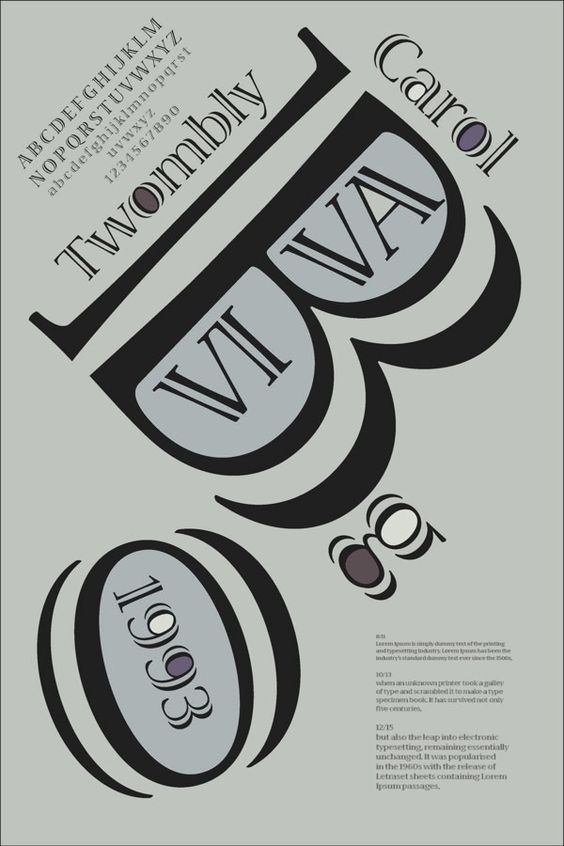
Carol Twombly never made a typographic composition herself; however, many other people have dedicated their time to make one in honour of her contributions and influence in the field. This composition was made by Stephanie Mc-Intire in 2014, and they are using the font that Twombly made in 1993 called “Viva”.
On the top left is a showcase of the letters in upper case and lower case, and the numbers 0-9. Carol Twombly’s name is added on the two sides of the “B” and inside the spaces there is the name of the font, Viva. In a way, the capital “B” in this typeface resembles a person wearing sunglasses with a moustache, which I thought was cute and silly.
The lowercase “g” underneath the “B” looks like a mouth that is blowing a bubble, which would be the “0” and inside of the space of that number is the year that the font was released. The very small text in the bottom right is background information on the font, for example, how it was made, how it’s used, etc.
The purpose of this composition seemed to be something light-hearted and used creative positioning of the letters to make a facial expression that wouldn’t normally be able to be made with the standard font. The designer used very unsaturated colours consisting of grey, white, black and purple.
This creates contrasts and points of interest throughout the design that help guide the viewer's eyes to where they should be looking. The composition only has one typeface, and they use three different sizes to express the importance of information in the text. This design is creative and unique by using the typeface, positioning, and size to their advantage to make a distinctive design.